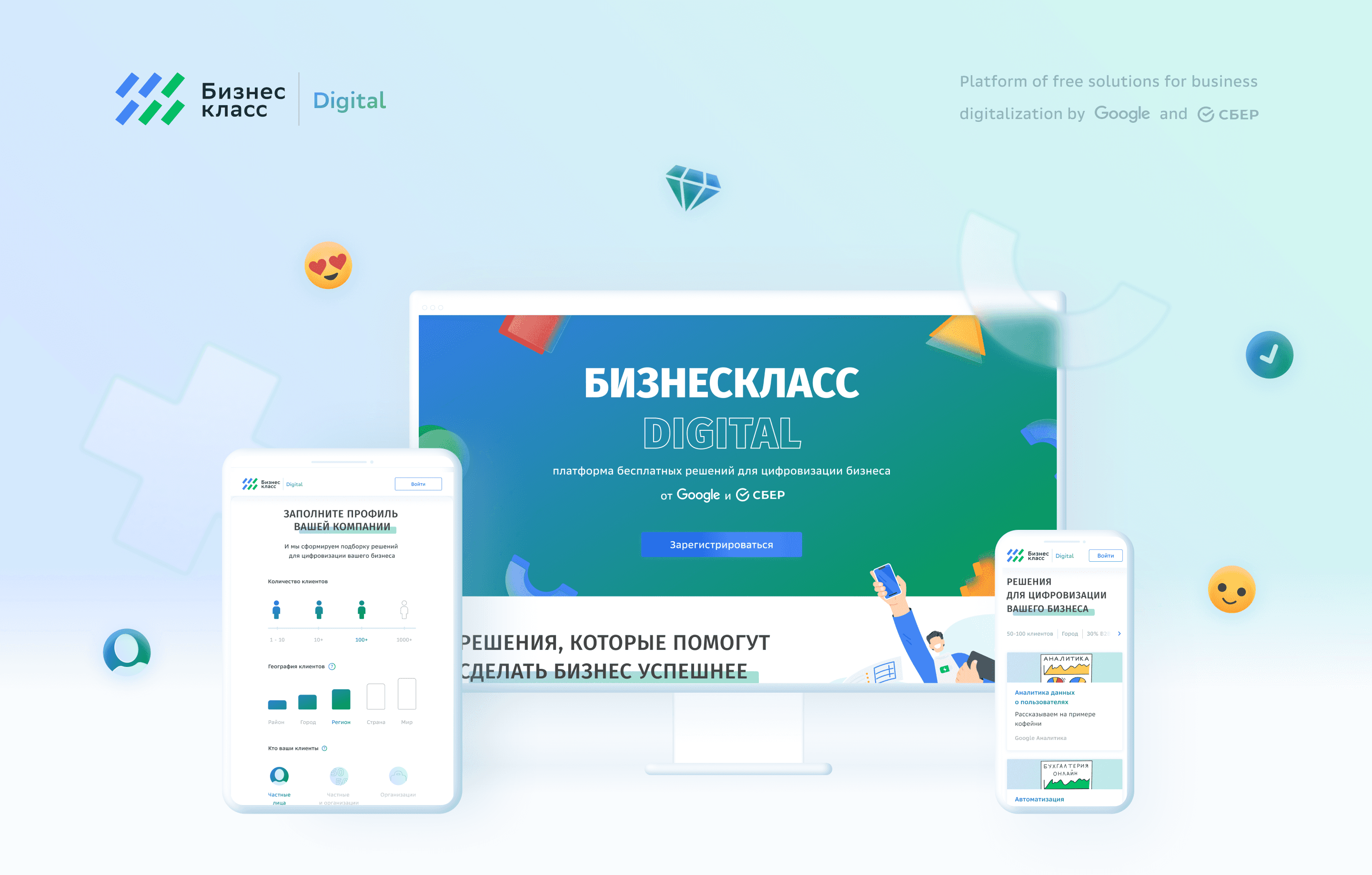
BusinessClass is a joint EdTech initiative between Google and Sber, aimed at helping small and medium-sized businesses in Russia transition to the digital economy.
BusinessClass is a joint EdTech initiative between Google and Sber, aimed at helping small and medium-sized businesses in Russia transition to the digital economy.
BusinessClass is a joint EdTech initiative between Google and Sber, aimed at helping small and medium-sized businesses in Russia transition to the digital economy.
Industry:
Industry:
Timeframe:
Timeframe:
Role:
Role:
Collaborative EdTech platform
Collaborative EdTech platform
4 months
4 months
Product Designer (UX/UI)
Product Designer (UX/UI)
Goal:
Goal:
The project’s goal was to create a modern, accessible, and frictionless interface that motivates business owners to explore, learn, and adopt digital tools.
The project’s goal was to create a modern, accessible, and frictionless interface that motivates business owners to explore, learn, and adopt digital tools.
Metrics:
Metrics:
Trained — 1 hour spent by the user on the site + viewing 7 content units (lesson, article, episode, webinar).
Trained — 1 hour spent by the user on the site + viewing 7 content units (lesson, article, episode, webinar).
The product consists of two main portals:
1. business-class.pro — main education hub with online courses, articles, and webinars
2. digital.business-class.pro — a library of step-by-step guides and tools for digital transformation
The product consists of two main portals:
1. business-class.pro — main education hub with online courses, articles, and webinars
2. digital.business-class.pro — a library of step-by-step guides and tools for digital transformation
The product consists of two main portals:
1. business-class.pro — main education hub with online courses, articles, and webinars
2. digital.business-class.pro — a library of step-by-step guides and tools for digital transformation
The product consists of two main portals:
1. business-class.pro — main education hub with online courses, articles, and webinars
2. digital.business-class.pro — a library of step-by-step guides and tools for digital transformation
product
product
product
UX Research (qualitative interviews, usability testing)
Information architecture
Wireframing & Prototyping
Full UI Design (desktop & responsive mobile)
Design system development and style integration
Handoff to developers
UX Research (qualitative interviews, usability testing)
Information architecture
Wireframing & Prototyping
Full UI Design (desktop & responsive mobile)
Design system development and style integration
Handoff to developers
Role & Responsibilities
Role & Responsibilities
Role & Responsibilities
UX Research (qualitative interviews, usability testing)
Information architecture
Wireframing & Prototyping
Full UI Design (desktop & responsive mobile)
Design system development and style integration
Handoff to developers
information architecture
information architecture
information architecture

Visual Language
Visual Language
Visual Language
The platform must perform its main functions and provide content to users. The design should not draw attention to itself and be intrusive, so the best option for these tasks is white color and free space
In this case, the design focuses on the details: the use of glass-effect shapes, accents with shadows,
and gradients, which give the interface depth and dimension
The platform must perform its main functions and provide content to users. The design should not draw attention to itself and be intrusive, so the best option for these tasks is white color and free space
In this case, the design focuses on the details: the use of glass-effect shapes, accents with shadows,
and gradients, which give the interface depth and dimension
Minimalism and simplicity
Minimalism and simplicity
BusinessClass Digital is a synergy of two companies Google and Sberbank, the design elements of each company were taken and combined as the basis for this concept
BusinessClass Digital is a synergy of two companies Google and Sberbank, the design elements of each company were taken and combined as the basis for this concept
BusinessClass Digital is a synergy of two companies Google and Sberbank, the design elements of each company were taken and combined as the basis for this concept

clean shapes, bold colors, simplicity
clean shapes, bold colors, simplicity
Sberbank
Sberbank
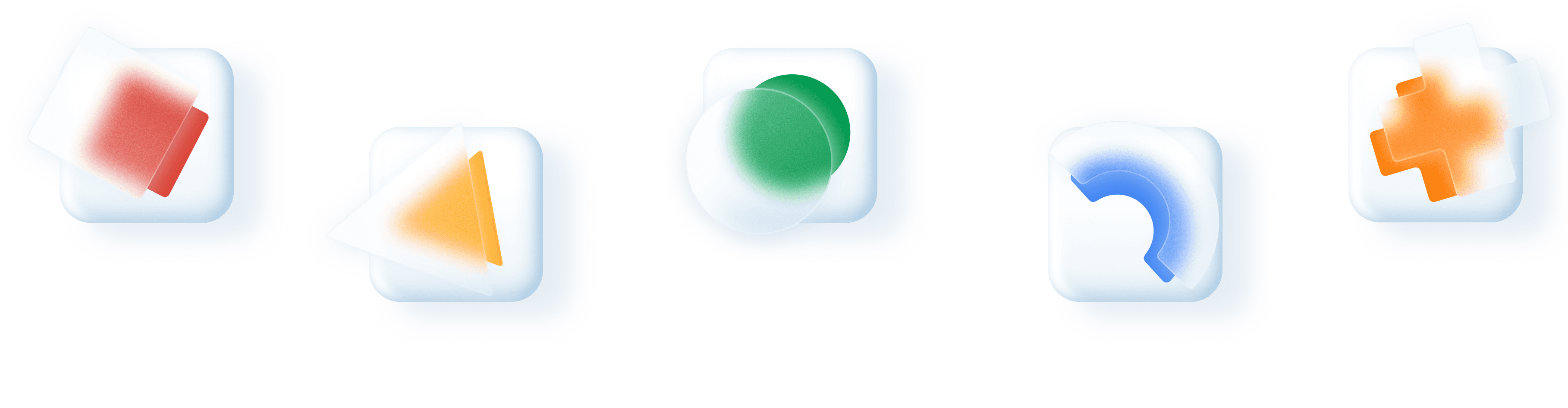
depth via glassmorphism, gradients, and soft shadows
depth via glassmorphism, gradients, and soft shadows
The overall success of the tasks is 94%, which is a high result
The overall success of the tasks is 94%, which is a high result
To ensure user needs were accurately addressed, the process included:
To ensure user needs were accurately addressed, the process included:
6 in-depth interviews with business owners and digital novices
Task-based usability testing of key user flows (registered/unregistered)
Heuristic evaluation of legacy solutions
Research & Testing
Research & Testing
Research & Testing
On the first banner there is no understanding that you can scroll down. Information blocks occupy almost the entire screen and are not interactive.
The top banner should not occupy the entire height. Merge two blocks of social proof.
The profile does not fit on one screen. There is no understanding of the Select button purpose.
Make elements of the Profile block more compact. Display virtual progress with the explonation text, when clicking on Select.
The purpose of the block Other solutions is not clear. Inconsistency of the user's business with the selection results.
Change the selection emphasis in the block of selected solutionson. Indicate the processes\digitalization tools instead of the Business name in the card’s catalog.
Unregistered user:
It is not clear where to focus attention on text or comics.
Design 3 solutions for the comics location, taking into account the difference in focus.
The action of the Finish button after passing through the instructions is not clear.
Remove the Finish button.
There is no understanding of what personalized solutions are offered next.
Divide Other solutions into two: Matched and Other solutions.
Registered user:
Found problems and proposed solutions
✅ 94% task completion rate during final usability tests — high user success
📚 7+ learning units completed per engaged user, with average session length of 1 hour+
📱 Full responsive UI design across desktop and mobile (5 breakpoints)
📊 Reduced drop-off on landing page thanks to improved entry-point clarity
🔁 Improved navigation loops: +22% interaction with personalized recommendations
✅ 94% task completion rate during final usability tests — high user success
📚 7+ learning units completed per engaged user, with average session length of 1 hour+
📱 Full responsive UI design across desktop and mobile (5 breakpoints)
📊 Reduced drop-off on landing page thanks to improved entry-point clarity
🔁 Improved navigation loops: +22% interaction with personalized recommendations
Outcomes & Metrics
Outcomes & Metrics
Key Research Questions:
Key Research Questions:
Is it clear what value the platform provides?
Can users find relevant tools and instructions easily?
Are the calls-to-action intuitive and well-placed?
Is it clear what value the platform provides?
Can users find relevant tools and instructions easily?
Are the calls-to-action intuitive and well-placed?
Key Findings
Key Findings
Users were uncertain about where to begin — homepage lacked scroll indicators
Banner overload: no interactive elements, unclear focus between illustrations and text
Ambiguous “Finish” button action
Confusing structure in personalized recommendations
Profile layout was too long and non-responsive
Users were uncertain about where to begin — homepage lacked scroll indicators
Banner overload: no interactive elements, unclear focus between illustrations and text
Ambiguous “Finish” button action
Confusing structure in personalized recommendations
Profile layout was too long and non-responsive
Solutions Implemented
Solutions Implemented
Rebuilt the information architecture for clarity and scannability
Added scroll cues, optimized banner hierarchy
Redesigned profile block with compact cards and visual progress indicators
Improved labeling: clearer CTAs, terminology aligned with user expectations
Grouped suggestions into "Matched" and "Other" to avoid cognitive overload
Created mobile-first layouts for 5 breakpoints (375–1920px)
Rebuilt the information architecture for clarity and scannability
Added scroll cues, optimized banner hierarchy
Redesigned profile block with compact cards and visual progress indicators
Improved labeling: clearer CTAs, terminology aligned with user expectations
Grouped suggestions into "Matched" and "Other" to avoid cognitive overload
Created mobile-first layouts for 5 breakpoints (375–1920px)
Here is an example of the unregistered user main page layout adaptation for five breakpoints. There are other three user flows.
Here is an example of the unregistered user main page layout adaptation for five breakpoints. There are other three user flows.
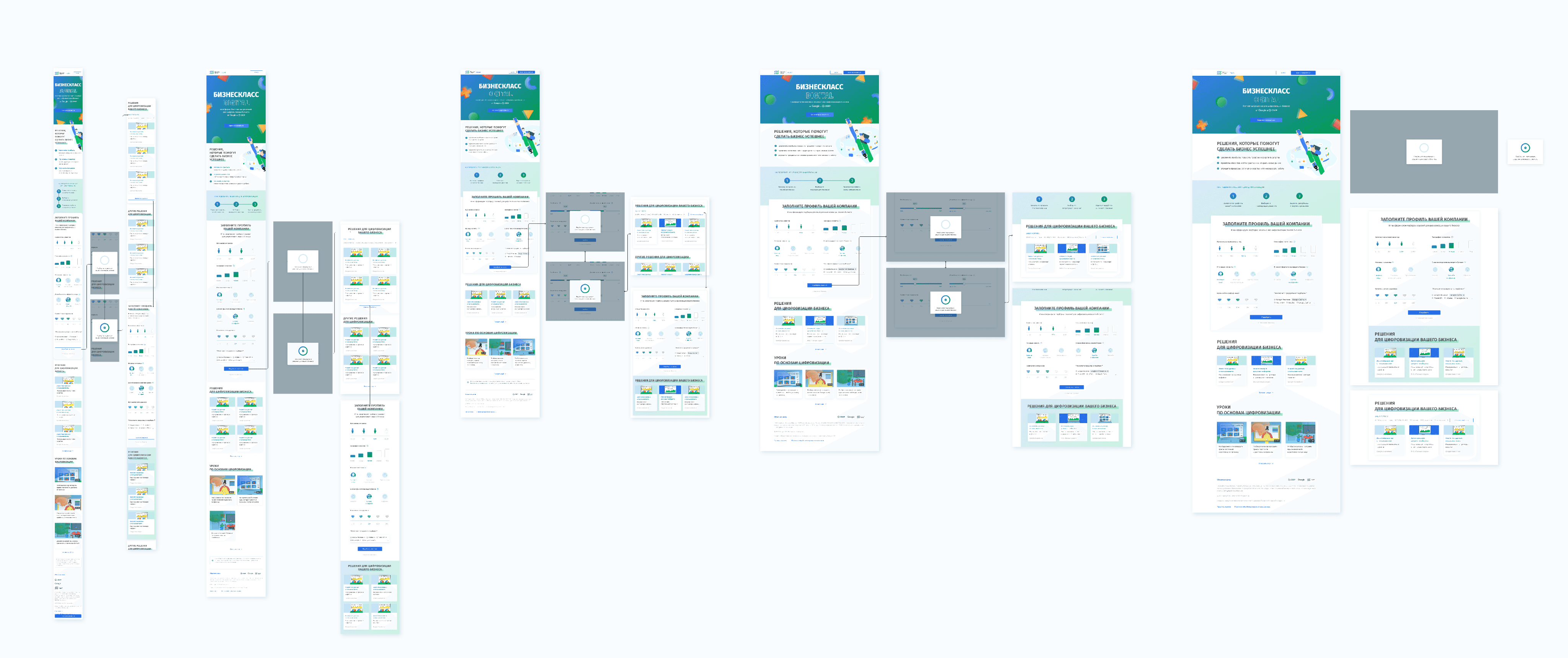
375
768
1024
1540
1920
Breakpoints
Breakpoints
Breakpoints
final solution
final solution
final solution

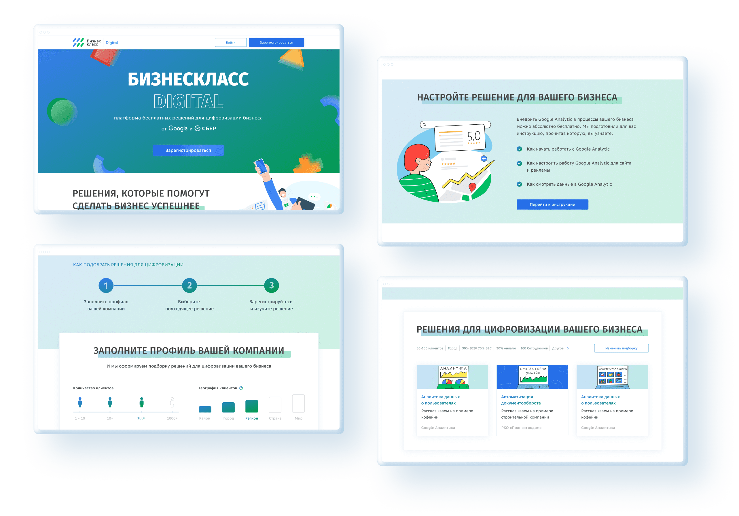
Starting with low-fidelity wireframes, the design evolved into a clean, responsive interface with clear user guidance, modular components, and a lightweight aesthetic.
Starting with low-fidelity wireframes, the design evolved into a clean, responsive interface with clear user guidance, modular components, and a lightweight aesthetic.
Wireframe to design
Wireframe to design
Wireframe to design
The challenge was to deliver a visually elegant system that doesn't distract — but empowers.
The challenge was to deliver a visually elegant system that doesn't distract — but empowers.
Desktop version


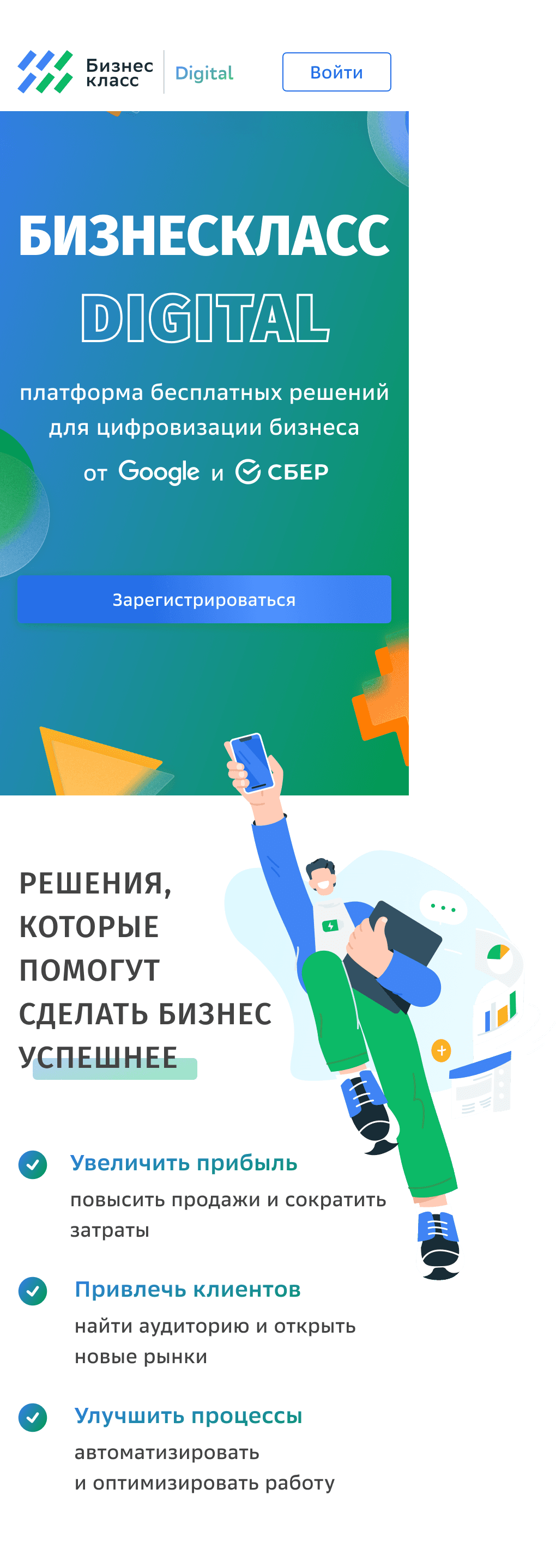

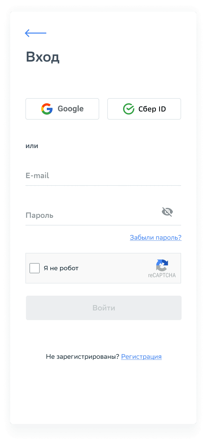

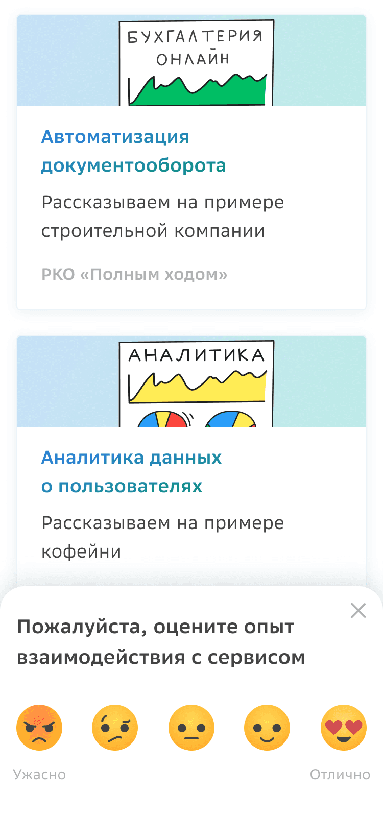
Mobile version

Projects
Projects
Projects